where color gets along.
A color wheel you can actually work on, 160 palettes worth stealing from, and the accessibility tools you were going to skip. Built for people who pick colors for a living, and for anyone who just likes them.
color wheel · palettes · contrast · extraction · eleven languages
Most design tools treat color as a setting: a small square you click, buried in an inspector, on the way to doing something else. Harmony Palette is the opposite kind of program. Color is the whole screen, the interface is loud on purpose, and the point is to spend time with it rather than get past it.
That is a design decision, not an accident. The thick outlines and flat blocks are there because a color needs a hard edge to be judged against. Put a swatch on a soft gradient and you cannot tell what you are looking at. Put it in a black box next to another black box and you can.
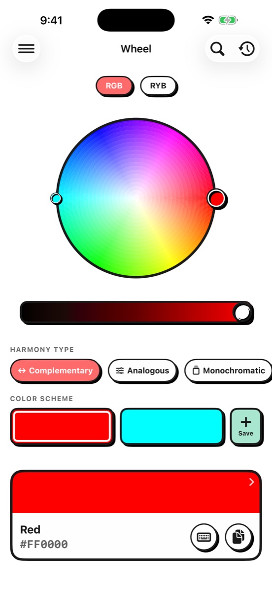
Ask a screen what the opposite of red is and it says cyan. Ask a painter and they say green. Both are right, and they are answering different questions: one is how light mixes, the other is the wheel taught in art schools and refined by Johannes Itten at the Bauhaus.
This matters more than it sounds. A triad that looks evenly weighted on the RGB wheel can come out lopsided in RYB, and a palette built for print behaves differently from one built for a screen. Harmony Palette gives you both models and lets you flip between them on the same color, so you can see the disagreement instead of picking a side by accident.
Two colors facing each other. The strongest contrast available, and the easiest to overdo.
Three neighbours. Quiet and cohesive, which is why so much brand work lives here.
One hue, worked through its shades and tints. Hard to get wrong.
Three evenly spaced. Vivid and balanced at the same time, which is a rare combination.
A base plus the two neighbours of its opposite. Nearly the same punch, far less tension.
Four colors, evenly or in pairs. Enough range for a whole system.
Complementary and analogous relationships braided together. Complex, and worth the trouble.
Four in the free version. The other four, and the curated library, come with Pro.
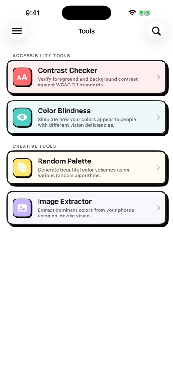
Contrast checking usually lives in a separate browser tab, gets done at the end, and gets skipped when the deadline moves. It is in here, next to the colors, while you are still choosing them.
Harmony Palette reports the WCAG 2.1 contrast ratio for any foreground and background pair and grades it AA and AAA, separately for normal and large text, because the thresholds are different: 4.5:1 and 3:1. When a pair falls short it can adjust the last color you touched until it clears the bar, so the fix takes a tap instead of a spreadsheet.
It also shows you the palette as someone else sees it. Protanopia, deuteranopia, tritanopia and achromatopsia, applied to a single color or to a whole saved palette, so you find out that your success green and your error red are the same swatch to a large number of people before you ship it rather than after.
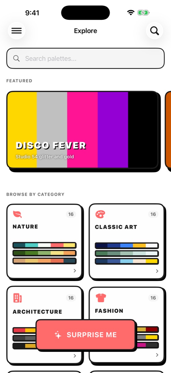
160 palettes, hand-picked across ten categories: nature, classic art, architecture, fashion, food and drink, geography, decades, abstract, holidays and branding. Starry Night is in there, and Bauhaus, and 70s Earth Tones, and the azure and sand of a Mediterranean coast. Each one carries tags, so you can look for a mood or a season rather than scrolling.
There are also 279 named colors, from the ordinary ones through to Papaya Whip and Gainsboro, so a color you land on has a name you can say out loud in a meeting.


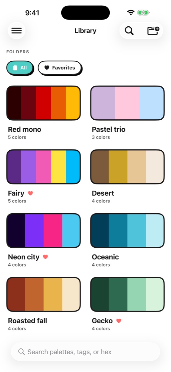
A palette that stays in the app is a mood board. A palette you can paste is work.
Pro exports SwiftUI and UIKit color extensions, CSS custom properties and a Tailwind config, ready to paste into a project without retyping a single hex value. For the other side of the job there is multi-page PDF for client presentations and SVG for print, plus social images sized for a square post, a portrait post or a story.
Free gets you HEX, RGB, HSL and HSV to copy by hand, which for a lot of people is all they ever need. CMYK sits with Pro, alongside the print exports it belongs to.
| Free | Pro |
|---|---|
| The full color wheel, both models | Everything in Free |
| 4 harmony types | All 8 harmony types |
| 15 saved palettes, 3 folders | Unlimited palettes and folders |
| Color extraction from photos | 160 curated palettes |
| HEX, RGB, HSL and HSV values | CMYK, the contrast checker and vision simulation |
| Sharing with a watermark | PDF, SVG and code export, no watermark |
Pro is $2.99 a month or $14.99 a year, both with a seven day trial, or $29.99 once for good, which includes everything added later.
Most apps translate their buttons. This one translates the colors.
All 279 color names and all 160 curated palettes, with their descriptions and their search tags, exist in every language the app ships in. A German user gets Mitternachtsblau, not Midnight Blue sitting inside an otherwise German interface. So does the palette called Sternennacht, described as van Gogh's swirling night piece, and the tags you would search it by.
Search understands both at once, which matters more than it sounds: if you first met a palette as Ocean Sunrise, in a tutorial or a screenshot, it is still there under that name no matter which language you now run the app in. Translation adds a way to find something. It never takes one away.
Nothing to sign up for. Open it and it works.
Every part of it, including extracting colors from a photo.
Color extraction runs on the device. Your pictures are never uploaded anywhere.
No advertising, no analytics, no data collection of any kind.
Palettes and folders follow you between your own devices, through your private database.
iOS 17.2 or later. One purchase covers both.
RGB is how a screen mixes light, so the complement of red is cyan. RYB is the wheel taught in art schools and refined by Johannes Itten at the Bauhaus, where the complement of red is green. Neither is wrong; they answer different questions. A palette that looks balanced on one can look lopsided on the other, so you get both and can switch between them on the same color.
Yes. It reports the WCAG 2.1 contrast ratio for any foreground and background pair and grades it AA and AAA for normal and large text. If a pair falls short it can adjust the last color you touched until it reaches 4.5:1. It also shows how a palette reads under protanopia, deuteranopia, tritanopia and achromatopsia.
Yes. Pro exports ready-to-paste snippets for SwiftUI, UIKit, CSS custom properties and Tailwind, plus multi-page PDF and SVG. The free tier gives you HEX, RGB, HSL and HSV values to copy by hand.
The free tier is a real tool rather than a demo: the full wheel, four harmony types, up to fifteen saved palettes and color extraction from photos. Pro adds the other four harmonies, unlimited palettes, the curated library, the accessibility suite and the export formats, at $2.99 a month or $14.99 a year with a seven day trial, or $29.99 once.
It works entirely offline and there is no account. Photo analysis happens on the device and your pictures are never uploaded. Nothing is tracked, there is no advertising, and no data is collected. If you are signed in to iCloud, palettes and folders sync between your own devices through your private database.
Eleven: English, German, Spanish, Latin American Spanish, French, Italian, Japanese, Korean, Dutch, Brazilian Portuguese and Simplified Chinese. All 279 color names and all 160 curated palettes are translated too, and search matches both the translated name and the English one.